Website Layout Ideas 2022
Website Layout Ideas For Modern Business
With the coming of mobile phones all books on how to layout a website became obsolete. The new standard is everything has gone BIG and simple. But every website design is different.
Designing the layout of a website now is not what it used to be. Now more than half the searches made are done via phones. You have to design the layout so it looks nice from a desktop computer but still looks nice on a handphone also. That is the tricky part. I have been researching websites across the internet, mostly my competition.
One of the biggest mistakes I see being made is the focus has shifted from desktop design to only targeting the phone screen. You go to their website on your desktop and you see these huge blank spaces. Huge text and very little informative content. I feel cheated. We need a middle ground where there is beauty for phones with actual content.
MOBILE-FIRST WEBSITE DESIGN
This is one of those great terms that has become so popular it changed the internet. The problem is that so many companies have taken it literally to the point that it should say mobile-only. Many of the large design firms I have reviewed have eliminated page content in place of little small boxes with nothing more than a title.
WEBSITE TESTING TOOLS
For tools please refer to my page FREE SEO TOOLS.
OLD SCHOOL – DESKTOP ONLY
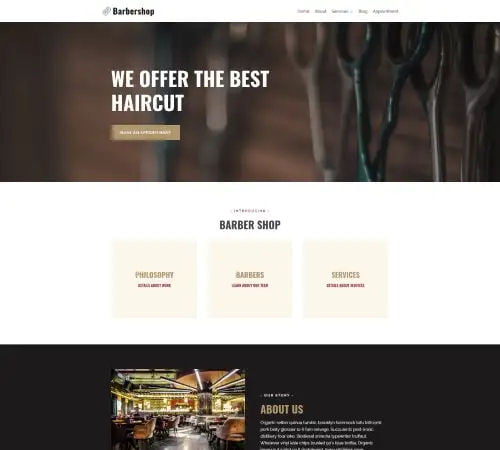
Website Layout – Main parts of a Web Page
Website Layout – The web pages may seem quite different from each other, but they all tend to share similar standard components unless the page displays a video or a game in full screen, are some kind of artistic project, or is simply poorly structured:
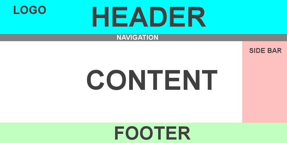
Header
Usually, a large strip is placed across the top of the page with a title or logo. This is where the main information on the site stays from one page to another. The header is the most important part of the site. It must be attractive enough to inform, guide, and retain your visitor. It should reflect all of the content on your site and its prioritization.
Navigation bar
It links to the main parts of the site; usually, it is presented as menu buttons, links, or tabs. Like the header, the navigation bar often remains consistent from page to page – having structured navigation can only lead to confusion and frustration for the reader. Many site creators consider the navigation bar part of the header and not as an individual component, but this is not a requirement. In fact, some also argue that having the two separate is better for accessibility because screen readers read the two better if they are separate.
Main content
A large area in the center contains most of the unique content of the said web page, e.g. the video to watch, the body of the article to browse, the map to read, the latest news, etc. This is the part of the site that varies from page to page.
Lateral bar
This includes some of the information around the subject, links, quotes, announcements, etc. Usually, this is contextual to the main content (for example on an information page, the sidebar can contain the author’s biography or links to related articles) but there are also cases where you will find elements recurring as a secondary navigation system.
Footer
The footer is a band at the bottom of the page which usually contains, in small print, copyright notices or contact details. This is a place to put common information (like the header), but this is non-critical information, even secondary to the website itself. The footer is also sometimes used for SEO purposes, providing links for quick access to popular content.
The header and the footer are the two areas of the site that will remain mostly unchanged, regardless of the web page. You should therefore focus from the start on what you want to include since these areas will be the key to SEO.
Navigation
To navigate through your web pages, your visitors will use your navigation menus. It is necessary that you have a structure through the different navigation menus and the rules to respect when designing them.
Principle
The first rule valid for all navigation systems is that, in
any menu, each label must be self-explanatory. In other words, your visitor
must be able to understand the type of information you are offering them and be
able to choose between two labels without the slightest hesitation.
Important!
Assume that each page of your website must answer the user’s questions:
- Where am I?
- Where can i go?
- How will I go back?
Tell yourself that a disoriented visitor is one less prospect!
To organize and prioritize your content, you have four options for navigation:
- Main navigation
- Secondary navigation
- Cross navigation
- Sequential navigation
1. Main navigation – Website Layout
The main navigation corresponds to the menu presenting the headings that you want to highlight. By convention, for a small site, the main navigation is in the header in the form of a horizontal menu.
I highly recommend this solution which respects the habits of Internet users and ensures comfort and simplicity.
- Must be placed in the same order on each page;
- Must have the same headings on each page;
- Musty have the same function on each page.
In this main menu, you need to present the navigation links to the most important pages of your website. The arrangement of the links in the menu is not trivial and should not be left to chance. You must therefore choose the order of the headings according to their importance.
The more the link is located to the right of the menu, the less the new visitor will click on this link to visit the corresponding web page. This observation applies to any site.
However, there is a way around this rule and to draw the attention of a visitor to a specific link. It involves proposing a call to action highlighted by a visual difference from that used for the headings of the horizontal menu.
Thus, to optimize the conversion and encourage your visitors to discover your website or your sales pages, it is in your interest to place an external link pointing to your prominent offer.
2. Secondary navigation – Website Layout
You can integrate links such as:
- FAQ
- Useful Links
- Site Map
- Terms and conditions
- Legal Notice
- Contact
- Partnerships and affiliation
- Links to pages that also appear in the main menu
- Links to your social networks
- A call to action (example: subscription to your newsletter)
- Links to recent articles.
After making a list of all your pages in your Website Layout and what you want to put there, you can choose the links that you will place in the footer by elimination. Everything that is not in the header must be in the footer. In addition, you can choose to offer certain pages both from the header and from the footer if you consider them essential.
3. Cross navigation
Cross navigation is navigation that does not follow the site tree structure. It takes the form of a link from a page that points to another page on your site, thus creating an internal mesh. This type of navigation does not follow any rules. It can be thought of before or after conception.
You could very well make this type of link between your “my services” page and
- an article from your blog that presents a specific case;
- one of your training courses present on your platform;
- your “contact” page to answer questions from your visitors.
- You could also use this type of navigation on your “who am I?” Page. To link to your “Testimonials” page.
Improve the positioning of a web page on Google by pointing to pages 1, 2, and 3 with internal links to page 4, Google understands that page 4 matters on the website.
4. Sequential navigation
Sequential navigation is navigation that works the same way as turning the pages of a book, one after the other, in a predefined order. This navigation is used for two reasons:
1) Present a logical continuation requiring proposing several stages
For example, you could use this type of navigation to present a series of articles from your blog following the logic of reading.
2) Reduce the bounce rate of a web page using a sequential navigation design.
Important!
The bounce rate represents the percentage of visits during which the user leaves your site from the entry page. This rate assesses the quality of the visits and your ability to retain your visitors. The bounce rate increases when visitors discover pages overloaded with content and presenting a long text (more than 2000 words).
To facilitate reading and not to discourage the new visitor you can split the page in half and invite the visitor interested in the text to click on a “see more” link.
When you set up sequential navigation, you can give users the option to go back. For example by displaying the “Next”, “Previous” links on each of these pages. Set up a clickable summary with links that direct your readers to the main chapters of your article.
How to design the categorization of your website adapted to your needs. Once the basics of navigation have been mastered, you must proceed with the categorizing. The heading consists in choosing the headings and their titles from the navigation menus. The choice of headings will help you build the tree structure of your website.
Your goal is to be as concise and impactful as possible in order to give confidence to your visitors, encourage them to take action, and give you their email.
Different Web Page Functions
I advise you to stay close to this model because originality ends in failure in the vast majority of cases. Remember that visitors come to your website with standards in mind and with an overwhelming need to understand everything at a glance. So leave no mystery behind your headings.

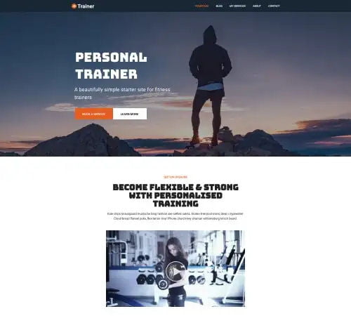
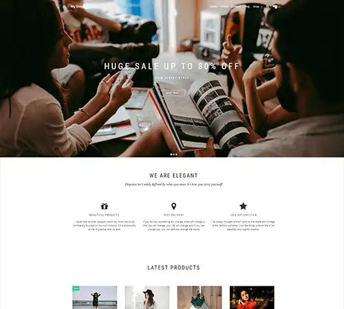
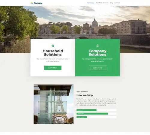
1. Home page
The home page is one of the most important pages on your Website Layout. It is on it that most visitors to your site make their first impression and their feelings about your business and your offer. It is the showcase of your activity. A poorly designed home page, not clear enough, not readable enough, unattractive, which does not sufficiently highlight your value proposition will undoubtedly make you lose many potential customers.
From your home page, your visitors should be able to quickly find an answer to the questions: “What is this business?” “,” What does it do, what does it offer? “,” What can I do with this site? “. If you are a well-established company (Nestlé, Fnac, etc.), you do not need to describe who you are and what you do. But for most companies, giving a clear answer to these questions on the home page is essential. Your visitors who have just arrived on your site must be able to tell themselves immediately: “I am in the right place”.
The design of the home page must resonate with your target audience, adapt to it. We want to speak here of “design” in the broad sense, including the way of expressing oneself, the wording, the choice of words …
Your home page should highlight a strong value proposition that grabs visitors’ attention and inspires them to learn more about your offer. The design of your home page must be optimized to function properly on all navigation media: computer, smartphone, tablet. This notably means avoiding overly complex elements, such as animations, pop-ups, flash banners, etc.
The home page should include a call to action (CTA) buttons such as “Try it now”, “Free trial”, “Book a demo”, “Buy now”, “Learn more”, etc. Always remember that the purpose of a home page is to encourage your visitors to navigate deeper into your site. The CTA buttons guide your visitors through your conversion funnel. Highly visible, CTAs transform your home page into a conversion page.
The design of your website must evolve over time. Quality home pages are never static. They evolve regularly, to integrate changing needs, enriching the offer, customer feedback. The home pages are also a special place for A / B Testing.
2. About US
Objective: introduce yourself or your team
This page can have different labels, such as Who are we, Getting to know us, or About Us. On this page, you will have to present your expertise, your experience, your passion. You need to show how you are the right person to meet the needs of your target customers. If you are a small team, you can talk about the history of this team, how it was formed and what are its common successes.
3. Services
Objective: to present all your services and your commercial proposals. Example of action: request for a quote
This page can have different labels depending on your activity: “My training”, “My products and services”, “My services”. It is on this page that you describe your services. You can optionally integrate sales page text and sales videos. You can also put links to your training platform. It is also on this page that you offer a “quote request”, “consulting” form for visitors who would like a service of advice, coaching, or non-standard or tailor-made training (not offered on your online catalog).
Please note: whatever your training theme, avoid the “basket” function, that is to say, the means allowing a user to make his shopping list before confirming and paying for his order.
This functionality is not really suited to the activity of the coach trainer. Very few people will order more than one training or service at a time. In addition, using it your conversion rate will be much worse than a simple payment button since it adds steps in the sales process.
4. Contact
Objective: To offer a simple and obvious way to contact you.
Example of action: contact (form)
This page allows your visitor to ask you for information on your offers, on your experience. He can ask you practical questions. It is also by this means that potential partners will contact you.
5. A legal notice page
Objective: reassure your visitors of your good faith and your transparency.
Example of action: a Call to action to your training platform
There are legal notices in French law that must appear on a Website Layout. In order to comply with your obligations and demonstrate good faith and transparency, you must include this web page.
6. A partnership & affiliation – Website Layout
Objective: attract partners and affiliates
Action: register for your affiliate program
You can offer several forms of partnerships on this page. On the one hand, I advise you to show that you are open to proposals by an expression of the type of partnership idea. You can also cite partnerships that have already been launched and that can give you credibility. On the other hand, you can present your affiliate program: your conditions, your% on sale, and an external link pointing to your affiliate platform.
7. A “Testimonials” or “References” page
Objective: gain the confidence of your prospects through social proof. Example of action: a call to action to your training platform. On this page, you present testimonials from satisfied customers to justify the quality of your product/service. These testimonies can take the form of a quote accompanied by a photo, or even the form of a short video. You can also show company logos if your customers are companies.
8. Site Maps
Site maps are seldom used for individual visitors. Mostly site maps are structured document that informs the search engine of all the pages in your Website Layout.
9. Privacy Page
This is where you inform your visitors what information you collect, what you do with it, and how they can retain control of it.
10. Blog section
To obtain a good positioning of your site on search engines like Google, the key to success besides the Website Layout is to produce quality, specific, regular content. Your objective will be to present your news or your expertise by producing an article per week, at least. I advise you to organize your blog using three or four themes or categories at most to classify your articles. You can completely create your blog without going through a thematic organization (if you just need a news feed for your activity).