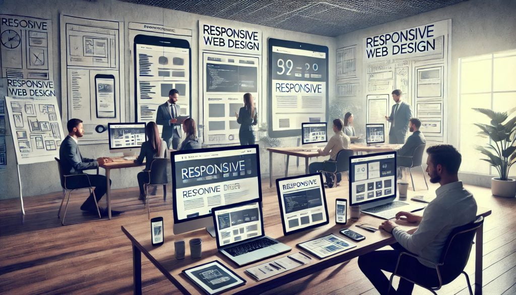
Responsive Web Design Adapts
No matter the size of the screen responsive web design will auto-resize to fit the requirement. Responsive web design is not entirely mobile design. Responsive web design is one size fits all. At Glenn Website Design, we leverage the power of Responsive Web Design to deliver superior service by ensuring that every website we create is optimized for all devices, from smartphones to desktop computers. This approach guarantees that our clients’ websites are not only visually appealing but also highly functional, providing an excellent user experience regardless of the device used. By using flexible layouts, scalable images, and CSS media queries, we make sure that each site adapts seamlessly to different screen sizes, enhancing accessibility and user engagement. This commitment to responsive design allows us to provide cost-effective solutions that cater to a wide audience, improving search engine rankings and ensuring that our clients’ online presence remains strong and effective in an increasingly mobile world.
Why Use Responsive Web Design
Responsive Web Design is a way to make websites look good and work well on all devices, whether it’s a phone, tablet, or computer. Here’s a simple breakdown:
Key Concepts:
- Flexible Layouts:
- Websites are designed using flexible grids that adjust to fit different screen sizes. This means a website can look good on a tiny phone screen and a large desktop monitor.
- Adjustable Images and Text:
- Pictures and text resize automatically to fit the screen they’re being viewed on, so they don’t get cut off or look too small or too large.
- CSS Media Queries:
- Special rules in the website’s code change how the site looks based on the size of the device. For example, a site might have one look for phones and a different look for computers.
- Mobile-First Design:
- Designers often start by making the site look good on mobile phones first, then add more features and styles for larger screens. This ensures the website works well on the most limited devices.
- Viewport Meta Tag:
- A piece of code that helps control how a website is displayed on mobile devices, making sure it fits the screen properly.
Benefits:
- Better User Experience:
- No matter what device you’re using, the website will be easy to read and navigate.
- Cost-Effective:
- One website works on all devices, so you don’t need to create separate sites for phones and computers.
- Improved Search Rankings:
- Search engines like Google prefer responsive websites, which can help your site rank higher in search results.
Real-World Example:
Imagine you’re looking at a website on your phone. Without responsive design, you might have to zoom in and scroll sideways to read text or see images. With responsive design, everything fits nicely on your screen, and you can easily read and navigate the site without extra effort.
Simple Visual:
- On a Phone:
- The menu might turn into a simple icon (like three lines, often called a “hamburger menu”) that you tap to see options.
- Images and text are resized to fit the smaller screen, so they’re easy to see and read.
- On a Tablet or Computer:
- The menu might spread out across the top of the screen.
- Images might be larger, and the layout might include more columns of content because there’s more space.
Responsive Web Design makes sure your website looks great and works well no matter what device people use to visit it.
Website Testing Techniques For Responsive Design
The easiest way to test that your website is responsive is to view it on various devices and browsers. Have your friends look at it and provide feedback. That is one of the methods we use to test our development of new websites.
Here at Glenn Website Design, all our designs are based on responsive, mobile-ready frameworks. We ensure that each web page achieves high speeds on mobile devices by testing with Google Page Speed Insights. Additionally, we conduct thorough analyses using GTmetrix for more detailed performance insights. Our final testing phase includes loading the website on multiple phones and computer displays to verify compatibility and performance.
For quick testing of mobile displays and other code information on any website from a desktop, we use Google Developer Tools built into the Chrome browser. Here’s how to access it:
- Click the three little dots in the upper right corner of Chrome.
- Choose “More Tools.”
- Select “Developer Tools.”
This opens a detailed window revealing all sorts of behind-the-scenes information. To return to normal viewing, simply click the X in the upper right corner.
To succeed on the Internet, your website must look good and function well on desktops, tablets, smartphones, and various screen sizes.
Types Of Responsive Websites We Offer:
Responsive Web Design is essential in today’s world, where people use a variety of devices and screen sizes to browse the web. Almost everyone has a handheld phone with a browser and internet connectivity. In many countries, people are more likely to rely on their mobile phones for internet access rather than expensive desktop computers. We live in a mobile society, and if your website is not responsive, you risk losing a significant amount of business. From shopping and chatting to reading books online, mobile phones are central to it all.
Responsive web design uses CSS and other code to adapt your web page based on the device a user is using. Modern platforms like WordPress, Joomla, Magento, and Drupal, as well as many free web design tools, already have the necessary code embedded in their templates. This means that when developing new sites, you don’t have to worry much about making them responsive.