B2B Challenge
You as the website designer actually have to consider all 3 actions in play, B2B2B. There really is no B2B in the real world. Someone is always the customer. Creating a website design for B2B can be very difficult because everyone always thinks they are at the top of the food chain. But you as the website designer have to keep in focus who that customer is. Your customer, their customer, or their customer’s customer.
- Create a presentation that sells your design
- Connect with your customer
- Create a design that sells to your customers, customer

The cascade effect of working with another business comes into play. B2B buyers take longer to purchase decisions. A single PO will need to be reviewed and approved by multiple stakeholders, from manufacturing to finance and even operations. The complex nature of B2B sales puts enormous pressure on the B2B side. It needs to look and feel like a B2C website while meeting the specific requirements of B2B buyers.
Well, that sounds like a typical mission scenario impossible for a website design marketer. However, there is a promising solution that could change the situation. You can start by optimizing your B2B site to improve conversions, which in turn will maximize your sales. So why is it so important to invest time and resources into creating a B2B website design?
Because your website is the gateway to the information buyers are looking for before making a decision. In fact, 27% of B2B buyers do an independent online search before finalizing their purchase. Properly designing your website can help increase traffic and conversions, which can ultimately lead to more sales. So how do you create a winning design? Here are six tips on how to improve your website design to attract more customers to your website:
1. Give B2B buyers a reason to stay on the site.
B2B buyers browse websites with serious intentions. If the site doesn’t provide them with the information they’re looking for or doesn’t bring them closer to finding the product their team needs, they quickly close the tab and move on to other alternatives. This makes it imperative to give B2B buyers a reason to stay on your website. Your website in its structure and content should respond to the problems and needs of B2B buyers. A common layout used by most websites to maximize user engagement and get conversions is the F pattern.
The pattern of the F pattern is based on the natural behavior of users when interacting with Internet surfaces. It is easier to read and also highlights the sections with which users are expected to interact the most. Consuming more content and interacting with your website is one of the precursors to conversion.
2. Use your content marketing to your advantage.
Your content can turn text on your website into conversions. Great site text can automatically grab the attention and trust of your site visitors, which is like winning half the battle. Building a content strategy is the best way to strengthen your product message. It will help you distinguish your product from the crowd of competitors who may offer more or less the same offers. By creating compelling content that resonates with your target audience, you can isolate differentiators that will make your customers choose you from the competition.
3. Let the videos convince potential customers.
Engaging content can help you attract attention and interest in your B2B offer. If you want to keep that interest alive and get your prospect to the final stage of their purchase, a video can help. Videos are how to create a B2B website design that has proven to be excellent content formats that can convince customers to make a purchase.
There are several types of B2B video formats that your business can experiment with to suit the tastes of potential visitors and visitors. They include:
- Explanatory Videos
- Product overview
- Instructional videos
- Demonstration Videos
- Product screen guides
- Customers opinion
The good news is that you don’t need a setup similar to Universal Studios to make movies. You can create marketing videos for your website with online video design tools like Adobe After Effects (Ae) and Fastreel. They take the form of DIY software and don’t require a lot of experience or expertise in filmmaking. Your time, effort, and persistence are enough to create great videos that will convince your potential customers to become paying customers.
4. Use chatbots to control initial conversations.
The first few conversations your site visitors will have with your business will determine whether they will become paying customers or become hard bounces that will never return to your site. B2B sites with great text can attract customers, arouse curiosity, and even make potential customers sign up for a trial or demo.
You need to understand how to create a B2B website design that creates customer interaction. However, if you want to act quickly and get visitors to provide details that can be used to qualify them as warm lead or hot lead, you need to conduct open conversations. Chatbots help in this. Think of them as always online sales representatives who can initiate conversations with your site visitors. They can convince users into entering their data, suggest product features, and even help customers find the resources they are looking for.
There are several benefits to incorporating a chatbot into your site: they make your content easier to access, collect user information, provide self-service, and much more. These and several other benefits make chatbots great for converting B2B leads. The catch is that chatbots are taken into account early in the design of a website, not after a second thought. Mapping your website design around chat balloons and the way they present information during an ongoing conversation can go a long way in ensuring a positive website experience.
5. Focus on UX design to improve sales conversions
Apple is the most valuable brand in the world. Guess what customers consider to be the biggest differentiator compared to other alternatives? User Experience? Yes, it is the secret sauce of most companies that have imprinted their identity in every market. That is how to create a B2B website design that works.
Needless to say, it also makes a huge contribution to sales conversions. A better user experience compared to the alternatives can put you ahead of the competition. In B2B sales, a website user experience can make or break a first impression on a purchasing manager.
The following tips should help you achieve UX at the very stage of creating a website :
- The page loads faster.
- The copy is legible with sufficient visual relief.
- Visualizations are of great quality and without distortions.
- The website flows naturally for maximum content consumption.
- CTA buttons are easy to click on desktop and mobile websites.
Are you looking for B2B UX inspiration? Head straight to HubSpot. Their website layouts, copies, CTAs, and visual treatments win the hearts of all B2B buyers.
6. Personalize the website design copy for each customer
Did you know best-selling author John Green has personally signed 150,000 copies of The Fault in Stars? Most of the signed copies were also accompanied by a personal message to the buyer. It’s real personalization. This level of personalization will create an emotional bond with the author, making the customer feel closer. They may even like it more, even if the book does not impress them.
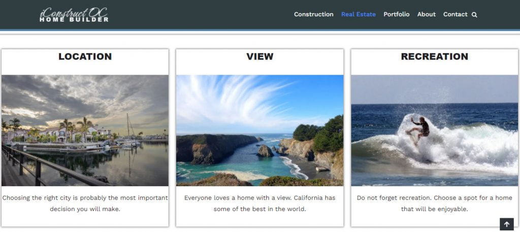
Here is an example: Personalization is the key to acquiring customers in any segment, B2B or B2C. Remember that personalization does not add a name token in the email; it involves obtaining practical data about users’ preferences, their desires, and the creation of content and products around them. This website is in the development process. The customer that ordered the construction/real estate website loves surfing so I tied that into the website we are developing part of his presentation. This is how to create a B2B website design with the business owner’s hobby included in what he has to offer his clients.

Your copy of your B2B site, which is the first thing users see and notice when they discover your site, should be personalized and compelling. This should give the impression that your company offers a solution to their problem and that they can be counted on.
Such a focused offer on your website will bring more conversions than a general message targeting many people at the same time.
Create a B2B site that sells
The B2B market is hard to crack. Expectations are higher, purchasing decisions take longer, and there are too many people to impress. A website that boasts a great, user-friendly design can help you put your foot in the door. Sometimes this first step in acquiring a potential client is enough for the rest of the contract to come through.
It is not easy to know how to create a B2B website design because each company is so different. For the vast majority, web design can mean the use of typography or visuals. However, the concept of B2B website design goes beyond all that. It’s about showing aesthetics while your prospects consider you as one of the options. If your website design can stand out as a differentiator in the consideration phase, you can quickly be shortlisted and be a winner that will win the deal.
Find More About Website Design How To Here