Best Layout Design is Custom Designed
There isn’t a one-size-fits-all answer for the “best” website layout design, as the ideal design often depends on the specific needs and goals of the website, as well as the preferences of its target audience. However, there are some proven website layout designs and principles that have been widely adopted due to their effectiveness in providing a positive user experience. Here are some of the most popular and effective website layout designs:
The F-Pattern Layout
The F-Pattern Layout is a website layout design approach that capitalizes on the natural way users scan content on a page, following a pattern that resembles the letter “F.” This layout is particularly effective for text-heavy websites, such as blogs and news sites, where users typically start by reading the top line, then scan down the left side of the page, and occasionally glance across shorter horizontal sections. Key features of the F-Pattern Layout include placing important content and headlines at the top left of the page, where users’ eyes naturally begin. The most crucial information is positioned along the top and left side, ensuring it captures attention quickly. In contrast, less critical content is placed towards the right or lower down the page, where it is less likely to be the first point of focus. This design technique helps guide users through content in a way that aligns with their reading habits, enhancing usability and engagement.
- Description: This layout leverages the way users typically scan content on a page, resembling the letter “F.” It is commonly used for text-heavy websites like blogs and news sites.
- Key Features:
- Important content and headlines placed at the top left.
- The most crucial information is positioned along the top and left side of the page.
- Less critical content is placed towards the right or further down the page.
The Z-Pattern Layout
The Z-Pattern Layout is a website layout design strategy that aligns with the natural way users’ eyes move when scanning a page, typically from left to right at the top, then diagonally down to the opposite side, and again left to right at the bottom. This pattern creates a “Z” shape across the page, making it ideal for simpler pages with less text, such as landing pages or minimalistic websites. The Z-pattern provides a clear path for the user’s eyes to follow, establishing a logical and intuitive flow of information. Essential elements like the logo, call-to-action (CTA), and key message are strategically placed at the start and end points of the “Z,” ensuring they capture attention effectively. Visual elements and whitespace are used to guide the user’s attention along this path, making the design both visually appealing and functional. The Z-pattern layout helps create a focused and engaging user experience by presenting information in a way that naturally aligns with how users view a page.
- Description: The Z-pattern layout follows the natural path the eyes take when scanning a page, moving left to right and top to bottom. It is ideal for simpler pages with less text.
- Key Features:
- A clear path for the user’s eyes to follow, creating a logical flow.
- Essential elements such as the logo, call-to-action (CTA), and key message are placed at the start and end points of the “Z.”
- Visual elements and whitespace guide the user’s attention.
The Grid-Based Layout
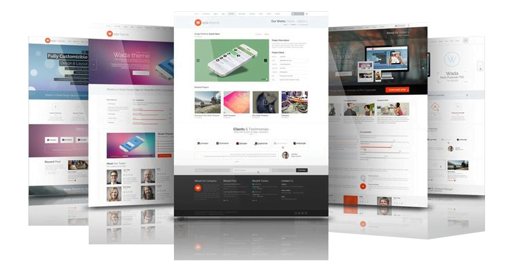
The Grid-Based Layout is a website layout design technique that employs a structured grid to arrange content in a balanced and visually appealing manner. This layout is highly versatile and can be adapted for a wide range of websites, from portfolios to e-commerce platforms. Key features of the grid-based layout include organizing content into rows and columns, which creates a clean and organized appearance. Consistent spacing and alignment are integral to this approach, enhancing readability and making navigation intuitive for users. Additionally, the grid structure allows for easy adaptation across different screen sizes and devices, ensuring a responsive and cohesive design no matter how the website is accessed. The grid-based layout provides a solid foundation for creating aesthetically pleasing and functional web pages that can accommodate various types of content.
- Description: A grid-based layout uses a structured grid to organize content in a balanced and visually appealing way. It is versatile and can be used for various types of websites.
- Key Features:
- Content is arranged in rows and columns, creating a clean and organized look.
- Consistent spacing and alignment improve readability and navigation.
- Allows for easy adaptation across different screen sizes and devices.
The Single Column Layout
The Single Column Layout is a straightforward and effective design approach that features a single column of content, making it particularly well-suited for mobile-first designs or minimalistic websites. This layout simplifies navigation by presenting content in a linear, uninterrupted flow, which enhances the user’s focus on the material being presented. It’s ideal for storytelling or guiding users through a specific journey, as the single column naturally leads the reader from one section to the next without distraction. Additionally, this layout easily adapts to various screen sizes, offering a seamless experience across all devices, especially on mobile. The Single Column Layout is perfect for creating a clean, focused, and user-friendly website that communicates your message clearly and effectively.
- Description: This layout features a single column of content, often used for mobile-first designs or minimalistic websites.
- Key Features:
- Simplifies navigation and enhances focus on the content.
- Ideal for storytelling or guiding users through a linear journey.
- Easily adapts to various screen sizes, especially mobile devices.
The Card-Based Layout
The Card-Based Layout is a modern website layout design approach where content is presented in individual “cards,” each acting as a self-contained unit. This layout is highly versatile, allowing cards to be easily rearranged and resized to fit different devices and orientations. Key features of the card-based layout include its ability to present information in a compact and organized manner, making it easy for users to scan and interact with each piece of content. This layout is particularly effective for displaying large amounts of information without overwhelming the user, as each card focuses on a specific piece of content or functionality. The card-based layout is commonly used in e-commerce, social media, and content aggregation sites, where it provides a clean, intuitive way to present diverse types of content while maintaining a cohesive design.
- Description: Content is presented in individual “cards,” which can be rearranged and resized for different devices and orientations.
- Key Features:
- Each card acts as a self-contained unit of content, making it easy to scan and interact with.
- Effective for displaying large amounts of information in a compact and organized manner.
- Commonly used in e-commerce, social media, and content aggregation sites.
Key Principles for Effective Website Layouts
When designing an effective website layout, certain key principles must be adhered to, regardless of the specific layout chosen. These principles ensure a cohesive and user-friendly design:
- Responsive Design: A responsive layout is essential for providing a consistent user experience across various devices and screen sizes. This adaptability ensures that the website looks and functions well whether viewed on a desktop, tablet, or mobile device.
- Clear Navigation: Simplified and intuitive navigation is crucial for helping users find the information they need quickly and easily. Clear menus, well-labeled links, and logical flow are all components of effective navigation.
- Visual Hierarchy: By strategically using size, color, and placement, visual hierarchy helps to emphasize the most important elements of a webpage, guiding users through the content in a purposeful way. This principle ensures that key messages and calls-to-action stand out.
- Whitespace: Proper use of whitespace—or negative space—enhances readability and allows key elements to stand out without overwhelming the user. Whitespace creates a clean and uncluttered design, making content easier to digest.
- Consistent Branding: Incorporating consistent brand elements such as colors, fonts, and imagery throughout the website reinforces brand identity and recognition. This consistency helps build trust and familiarity with the audience, ensuring a cohesive brand experience.
By applying these principles, you can create a website layout that is not only visually appealing but also functional, engaging, and aligned with your brand’s goals. The best website layout design is one that effectively meets the goals of the website while providing an intuitive and enjoyable experience for users. By considering the needs of the target audience and applying proven design principles, businesses can create layouts that engage users and drive desired actions.