It would seem that the selection of colors for a website is a simple task, and we can consider our own taste as a determinant of quality. This is partly true, but the website’s colors are not only a visual complement to the content. Color influences the subconscious perception of the website as a whole and communicates with the viewer on an emotional level. Let’s have a look at how to gently moderate these feelings.

The colors chosen for web design evoke different moods in the user, which he is not even aware of. A good choice of colors is the most direct way to create a good impression, and the aesthetic combination of colors gives the website a uniform and polished look.
There are tons of tools on the internet to help you generate a nice color palette for your website
Choosing Colors For The Website
There are many methods of selecting a color combination, but we’ll look at the easiest one that anyone can do.
METHOD 1 – START WITH A BLANK CANVAS
The first method is to build a color palette for your website from scratch. Of course, there are online tools for this, and there are really a lot of them.
These tools depend on selecting one main color, and algorithms select the others. But how to choose the main color? In the 32-bit palette we have 4,294,967,296 colors. Here you can be guided by your own taste and choose the shade of your favorite color that suits us, or use competing websites. Nothing prohibits you from viewing the colors on the websites of more established businesses. Of course, this is easy-going, but in many cases, it works. On the BrandColors website, you can easily view the dominant colors of the largest companies in the world.
However, if watching competitors does not bring a positive effect (some websites can be really nasty), then two websites designed for designers who boast about their works come to the rescue:
- Behance
- Dribble
METHOD 2 – START WITH A PHOTO
Photos can be a great source of inspiration when choosing colors to blend. This is most important for a specific photo which will be our primary image, viewable right away once the page loads.
Photos often form the foundation for the rest of the colors on a website. It is definitely easier to choose colors for a photo than to do it the other way around – look for the right photo for the already selected colors. Why is it easier? Well, as with Method # 1, there are also many online tools that will create a matching color palette based on your uploaded photo: the best being Canva.
All aspects of the website will mix effortlessly and create a coherent visual identity by borrowing colors from the images. A great, eye-catching photo on which the remainder of the website’s colors is based would strengthen the impression of uniformity.
METHOD 3 – START WITH YOUR BUSINESS GOALS
However, if we do not trust our taste, photos, or competition, then there is a third option – color psychology. This broad concept covers, inter alia, our associations with given colors. Different colors will send different messages to users, changing their perception of the website, even if it was not intended. So if we run a travel agency, we should choose green or yellow. The former, of course, is associated with nature, and the latter with the sun. This is a perfect way to develop a travel agency website. Following this path, blue will also be appropriate – depending on the shade, it evokes associations with water or sky. But it was simple … too simple. The psychology of colors is also based on associations that we have no idea about, for example:
- red – love, energy, bravery, speed,
- yellow – joy, optimism,
- green – a sense of security, development, credibility,
- blue – confidence, stability, health.
This doesn’t sound very plausible at first, but science has shown that red can make your heart beat faster, while blue has a calming effect. For example, in 2000 Glasgow introduced blue street lighting to improve the city’s landscape, which inadvertently led to a noticeable reduction in crime rates in blue well-lit areas. Another example – is Tokyo’s Yamanote Railway decided to install blue lights at the ends of railway platforms to reduce the number of suicides. As a result, the number of suicides at these stations dropped by as much as 74%.
This likely explains why most medical and pharmaceutical brands choose blue as their primary color.
This is important because many users make purchasing or business decisions based on colors and these subconscious associations. What’s more – according to research, as much as 90% of quick purchases result solely from color perception. In this case, the rule that the first impression is the most important applies. Especially since it doesn’t last long. According to other studies, the average time an internet user maintains attention takes … 15 seconds.
Color psychology is used to create a certain impression. If the goal of the website is to sell anything, it’s important to select colors and hues that elicit the desired feelings in website users.
Market researchers and brand managers use the psychology of color very often. Restaurants, for example, are often red and orange, banks and financial organizations are blue, and luxury things are typically packaged in black. In recent times a lot of companies are returning to the 60s style of psychedelics and retro advertising styles.

Color Perception Depending on Age and Gender
In order not to be too colorful, there are also other variables that make website visitors react differently to colors. A lot depends on the gender and age of the recipient. That is why it is important to know what the target group is when creating a website.
Nearly 2,000 men and women were polled to see which color they preferred: purple, blue, green, yellow, orange, red, or pink. Blue is the favorite color of 42% of males, followed by green (25%), and purple (25%). (12 percent ). Blue was also the most popular color among women (29%), followed by purple (27%), and green (27%). (19 percent ). The distinction is small, yet it may have a huge impact on the performance of a website.
What Colors to Avoid
It is also important to consider your least favorite colors. Of course, this has also been studied, and it turns out that, regardless of gender, we don’t like brown and orange. 17% of women also chose gray in their TOP 3 ranking of the least favorite colors.
However, it is difficult to say unequivocally which colors are not suitable for our website design at all. Much depends on the region (in the United States men do not like pink, although in Italy it is considered masculine), as well as on trends or individual preferences. Pastels may be popular today, and vivid and bright colors tomorrow.
Blue, red, and green are the three dominant colors that appear in almost every industry and can be considered “safe”.
However, there is one exception to the blue color. According to food researchers, at a time when people were looking for food, they learned to avoid toxic or spoiled foods, which were often blue, black, or purple in color. When study participants were given food colored blue, they lost their appetite.
Variety of Color
While there is no hard and fast rule, the more colors you use, the harder it is to create a unified design. Interior and fashion designers have a 60-30-10 rule that the three colors should be used differently (60%, 30%, 10%) to create perfect harmony. The three colors on the website are also the right balance between gray-gray and motley.
- The primary color should be approximately 60% of the space and form the overall unifying theme of the design.
- The next 30% should contrast with the 60% to create a visual effect,
- Then use 10% as the “accent color” and should complement the base or spot color.
A men’s suit is a great illustration of this idea in action: the jacket and trousers account for around 60% of the total look, the shirt for 30%, and the tie for 10%.
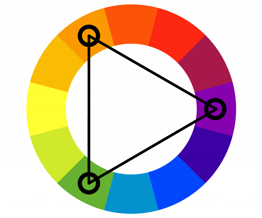
The primer is to have the primary, dominant color to which the other colors will be matched. You can do this using bulleted points as in method 1 above. We can also do it ourselves, using the several hundred years of color theory, the basic principles of which can be found, among others in the notes of Leonardo da Vinci. A good starting point is the triadic color scheme, which has three hues evenly distributed around the color wheel.

However, when we are tempted by the next, fourth color, it is worth using the shades of the already selected color. By doing this there will be no requirement for a fourth or fifth color in the website design. As a result, we rule out the potential that the new hue may conflict with the present scheme.
Font Color
It seems like a simple choice, use black. Reading books for centuries has conditioned people to expect black writing on a white backdrop. What we perceive as black, on the other hand, is frequently an extremely dark gray, very near to black. This not only applies to books, but also to websites. Simply go to any news site that has a lot of text. We seldom see absolute black there.
Absolute black does not always aesthetically match the rest of the page. It appears to be of high quality and contrasts with other hues. This is especially true for fonts on a white background. The solution is to use a really dark gray – sure, it’s evident now. It will still remain black for the most insensitive, but it will be much more incorporated into the overall website. Absolute black, on the other hand, is worth saving for headlines. This will help them stand out from the rest of the content. If we’re already discussing black, then…
Most Important Color
White is the most important color. It is the most neutral color and perfectly contrasts with the text and other important elements of the website. White allows the visitor to “breathe” and gives time and space to better process the information contained in the content of the website. Yes, it’s a cliché. Unfortunately, many website designs are saturated with details that distract from what is most important. And the most important thing is content and minimalism, especially if we don’t have millions of dollars to spend on market research to test our “crazy” idea to deviate from the rule.
The latest trend is the so-called “dark mode” which is a night mode that inverts text and background colors. We then get a dark background with bright text, which is less tiring to the eyes and saves battery in smartphones. Nothing stands in the way of using such a contrast also on our website. Then the roles of black and white are reversed.
The combination of black and white is a safe arrangement – these are two colors that will never go out of style. However, such a monochrome color scheme can be based on any color, as long as they come from the same color and represent different shades of it.
Okay, let’s say we’ve got all the colors already selected. Now comes one very important question …
Color Placement is Important
Of course, there is no simple rule. Much depends on the feel, the chosen colors, and the information that is to be on the website. To make things a bit easier, consider the following three suggestions:
- The main color can be used in “hot spots” on a website to grab users’ attention and encourage them to take action. There are, among others buttons, headers, icons, and all other important elements that the visitor should pay attention to. For this reason, vivid, eye-catching color is so often the dominant color.
- Secondary color can be used to highlight less important information on your sites, such as standard links, menu items, or other supporting content. It can also be used as a background for selected sections.
- Tertiary color will be useful for unobtrusive little things – for example, frames, underlining, or fragments of icons. It also often fits as a color that appears only when you hover the mouse over specific elements, such as links or buttons.
Gradients on a Website
Gradients, i.e. smooth tonal transitions between different colors, are quite a dangerous subject. When used successfully, they can give the website a modern and fresh look, but in many cases they are used inappropriately, mixing mismatched colors or shades. For this reason, many web pages with gradients look old, as if they were from the previous decade.
If we decide to use a gradient, it is worth using colors that are very similar to each other, with similar tones. Shades of the same color will be best, so that the gradient will look modern, resembling more gloss or a slight discoloration that gives the elements of the website an original look. If you choose different colors for the gradient, it’s best to put a few intermediate colors “along the way” between them to make the transition smoother and more pleasing to the eye.
Conclusions
Of course, the theme of colors on the website has not been exhausted in any way. The above advice is not a manual to be followed blindly. These are only tips and an incentive to look for your own solutions. After all, the most memorable are all exceptions to the rule.
You just need to know how and when :).
Are you interested in creating a website?
PLEASE CONTACT US