The importance of colors in advertising and marketing
How do colors affect us?
The Colors in Advertising and Marketing have a lot of influence on us. It is said that we buy with our eyes. Let’s take a look at the importance of color in advertising and marketing.
During the last race for the presidency of the White House, the media drew attention to Donald Trump’s tie. Its red color was supposed to give him an advantage. It was certainly not insignificant. Red attracts attention, symbolizes strength, and in this case refers to patriotism – the color of the flag of the United States.
How much influence do Colors in Advertising and Marketing have on the environment? You can look for inspiration among fauna and flora. There is a reason why the flowers are most colorful. Their color attracts insects, which gives a greater chance of pollination. Similarly, when it comes to animals – their color often helps in winning a mate, but it can also be a warning signal, e.g. about venomousness.
Color psychology in advertising
Let’s get back to the people. Our brain, recognizing colors, can associate them with brands. Their importance can be proved by the fact that large companies register color as a trademark. It was done by brands such as Coca-Cola, Nike, and Google.
When choosing a product, consumers pay great attention to colors. For example, car manufacturers take advantage of this. They offer an ever wider range of colors to choose from. In their activities, they go even a step further, giving them names that are pleasantly associated. Let’s look at a few colors from the BMW palette: black sapphire, sunset orange, or Mediterranean blue. Don’t they evoke pleasant associations?
Color psychology is of great importance in our choices. Colors such as red, orange, and blue are associated with purchasing impulses. Does this mean that all brands should go towards these colors? Of course not, but it’s worth knowing how certain colors affect people’s perceptions.
Red in advertising

photo Ferrari is successfully using the color red
Red is a very strong color, it is associated with love and power. When shown in context, this color can heighten the feeling of fear. It undoubtedly draws attention to itself. Every driver associates the stop and the red light. They tell us to act immediately. In the automotive industry, red is used to emphasize the car’s sporty accents. This color of brake calipers, varnish, or sewing on the upholstery is to attract the eyes of a potential customer. In advertising, this color is commonly used to promote Valentine’s Day and horror movies.
Orange – a combination of yellow and red
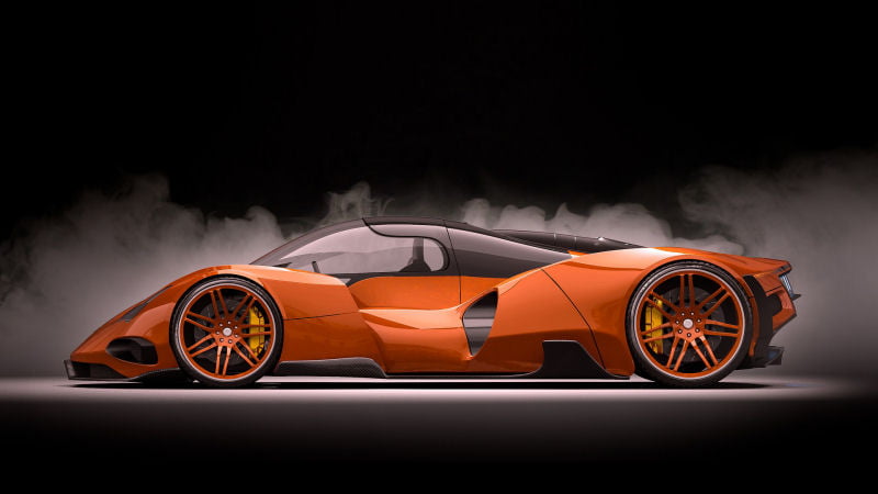
photo concept vehicles makes great use of the orange color.
Orange is a combination of red energy and joy emanating from yellow. This color is warm and gives a sense of comfort. It can also increase our appetite. Overall, this color has a positive effect on our attitude and motivation. Compare this to the red Ferrari you get a more relaxed feeling even though the design is obviously more powerful. For a selling point, red is definitely the best choice for cars.
The meaning of the color – yellow
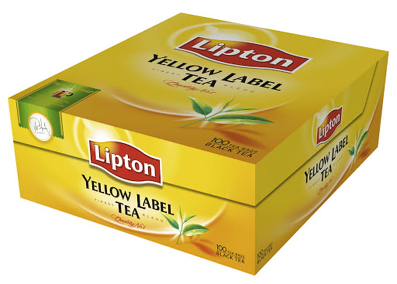
photo Yellow Label Tea Lipton
Yellow means joy and happiness. This color is optimistic and warm. Do you want to convey an inspiring message to your client? Use that color. Research shows that its use increases the willingness to take action.
Green color – meaning

photo A professional-looking packaging with the use of green color
The color green is a combination of balance and harmony. We associate it with nature, it gives us peace and relaxation. It is also a symbol of growth. People on the stock exchange certainly know him well. In marketing communication, it can be useful for showing how the product can relieve stress. It is commonly used for organic products and in restaurants. The use of green also reflects upon thoughts of environmentally safe products.
Blue color psychology
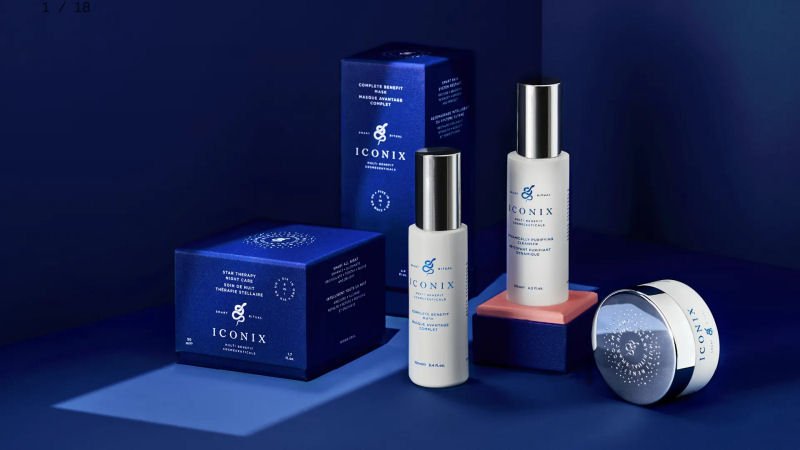
photo Dark blue Iconix skincare packaging
Blue in advertising stands for trust and reliability. It is associated with stabilization and security. It is one of the favorite colors all over the world (ours also, especially in a dark, navy blue edition, like in the Iconix packaging). This color is associated with business and startups, and the financial world. Blue is a color suitable for building relationships in marketing, it gives a sense of security. It is a cool color, and water producers use it. In this case, it is associated with refreshment. It is also commonly used in swimming pools and SPA facilities.
Violet color
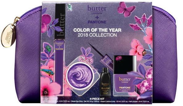
photo butter LONDON’s face and nail kit is clearly associated with the color purple
Violet is a combination of the energy of red with the reliability of blue. It is a mixture that indicates balance. It is used to emphasize luxury, loyalty, but also magic. It is a color that is associated with creativity.
Pink color
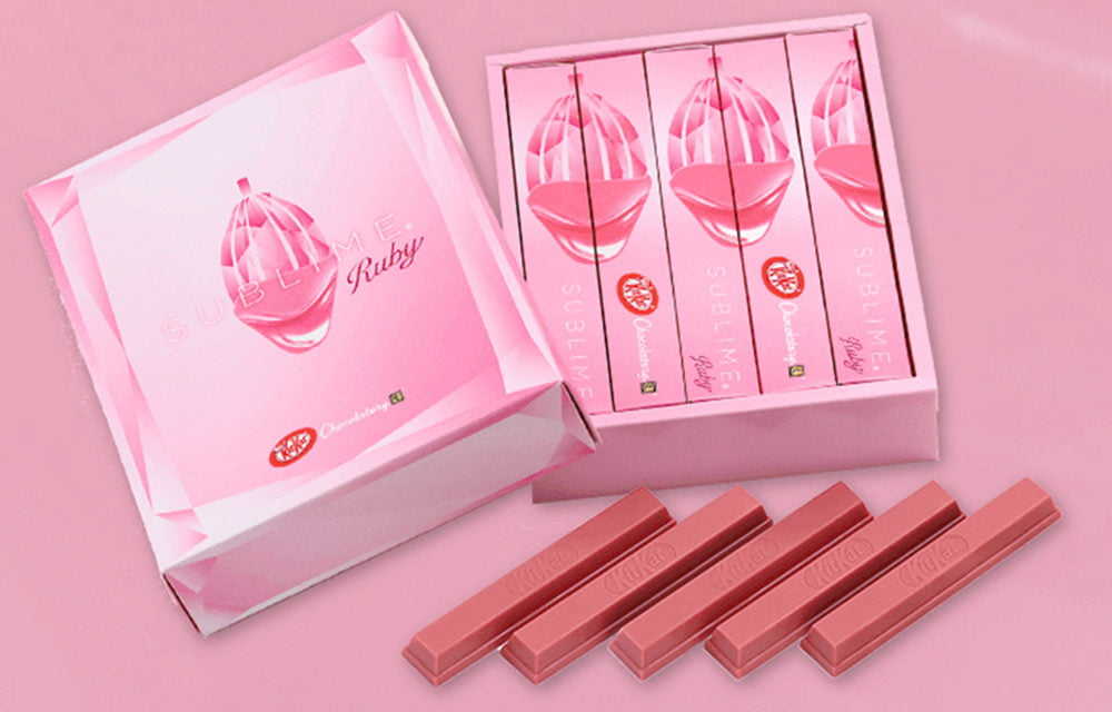
Example of bad use of colors KitKat uses pink for girls NOT FOR ME
Pink is a softer version of red. It is a color associated with feelings. It expresses love, caring, and understanding. It is romantic, it gives a sense of hope. However, you cannot overdo it, because then it can be seen as a show of weakness. It is a feminine color associated with cosmetics, jewelry, and wardrobe accessories. As in the case of KitKat, I just do not get it.
Golden color – does it only mean luxury?

photo Golden CHEVROLET branding
In addition to luxury, gold also means self-confidence. It shows attractiveness and prosperity. It is worth considering the use of gold in advertising and marketing, but not overdoing it with its amount. Rather, let’s use it to highlight certain features of our product.
Black color – meaning
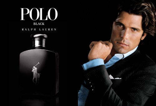
photo Polo Black Ads
Black is a classic color, associated with refinement and independence. Black appears to be a neutral color. However, in the right context and quantity, it can be used to show evil, secrets and even death. Black is the color most often used in text. The reason is simple. Black text on a white background has the greatest contrast and therefore is best readable. By using black, you can emphasize the elegance of your products. This color has been in fashion for years and nothing promises that classic black will disappear from the world of marketing and advertising.
What does white mean?
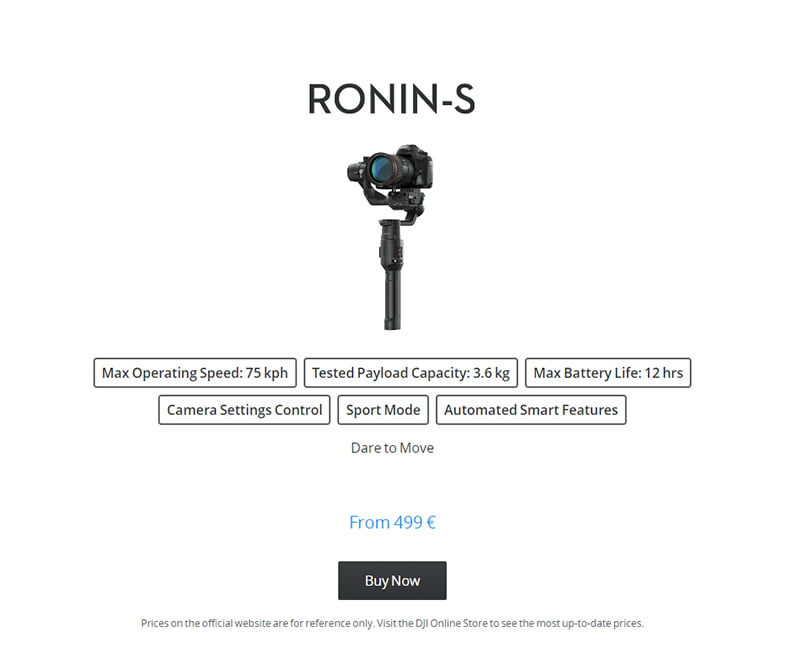
photo DJI
White is another of the timeless colors. It symbolizes purity, innocence and peace. It is often combined with black as these colors contrast well together. White also means something new.
As you can see, there are really many ways to communicate with the customer with colors. They should be selected appropriately depending on the context and the story we want to convey.